So I’m working on a bit of a refresh of this site. Slowly… very slowly. As I mentioned previously, yesterday was focused on some small tweaks for how some minor things work in the background and then show up—probably not too noticeable.
Today, my focus is on fonts—both Header and Body. I’ve collected a few, but am completely indecisive and need some help deciding.
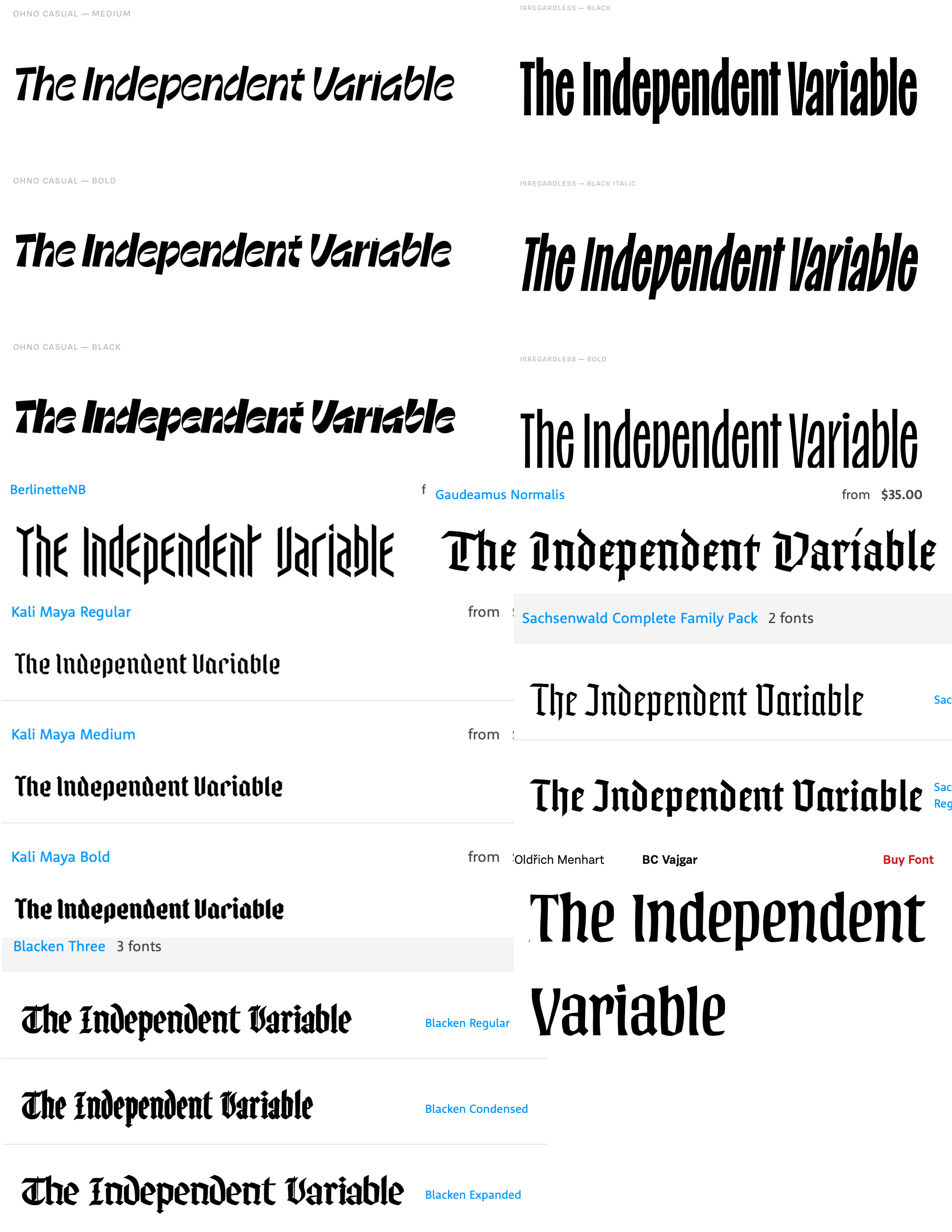
If you don’t care about my thoughts on each font, feel free to skip down to the image and let me know, which is your favorite.
Going into the exercise, my goal was to try to find something that felt like Old English a la The New York Times, but more modern and playful.
I think I’ve found a few that meet that criteria between Gaudeamus, Sachsenwald, Kali Maya, and Blacken. But… I’m not sure… Kali Maya feels a bit stiff, Sachsenwald a bit boring, Blacken a bit crowded, and Gaudeamus too close to Old English..?
Then I came across BC Vajgar on Robin Sloan’s site. It’s basically a more playful version of what I’m already using on my site, Albertus Nova, which I also stole from Robin Sloan years ago. So this might be a good route to take for a slight upgrade of playfulness. But I think I’d like to avoid stealing from Sloan twice in a row…
Berlinette is a bit of a departure from the original goal, but I kind of love it. It feels like a middle ground between Albertus Nova and Fit Devanagari, which is what I’m using over on foofaraw.
Lastly, there are the two typefaces from Ohno (who I really, really like and have a few typefaces for the body font queued up to dig into later). Irregardless is probably a bit too plain for what I’m going for, but still has a tinge of playfulness making it really nice for a wide range of uses. Then there is Ohno Casual, which has all the jus I’m looking for, but feels a bit too much of a departure from the blackletter style I’m going for. And still, gun to my head if I had to choose right now, it’s probably what I’d go with.
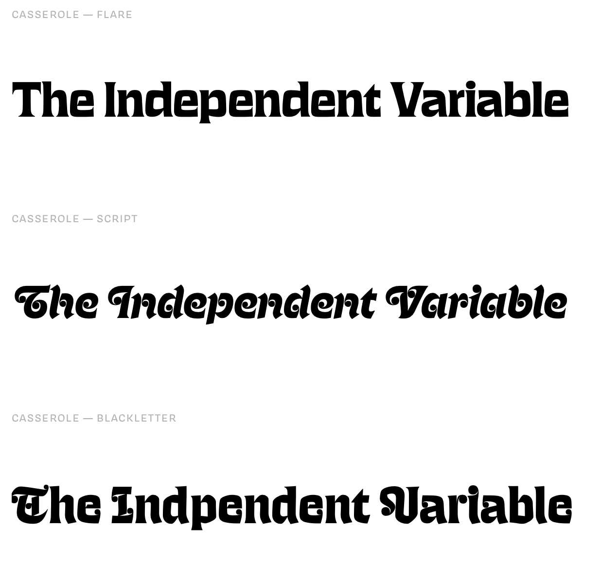
Not pictured, but also from Ohno is Regrets, which I love and would probably leap at if it had a thicker/bolder style, but I don’t see the thin line faring well for this use-case. And then there is Casserole, which, now that I’m looking at it again, should definitely be in the race… and is maybe the front runner…? Oi vey…