🗞️ My Three Sheet Tri-Fold Zine Idea
30 March 2023 zines
My first issue of nonsense. was essentially a proof-of-concept trying to figure out how I could put something on a page that would be printable and mailable1. I’ve been playing around with the idea of printing zines for a long time, with many half-started zines in many different formats, but there was always a bit of a barrier from designing and writing stuff to actually getting it into a workable, printable format that made sense.
In the end, I had a single sheet of paper with three columns on each side for a simple z-fold and it worked. I charged $3 for it, which was admittedly too expensive for the “value” provided, but it ended up costing me exactly $2.99 per issue to print and mail out ğ¤·ââï¸.
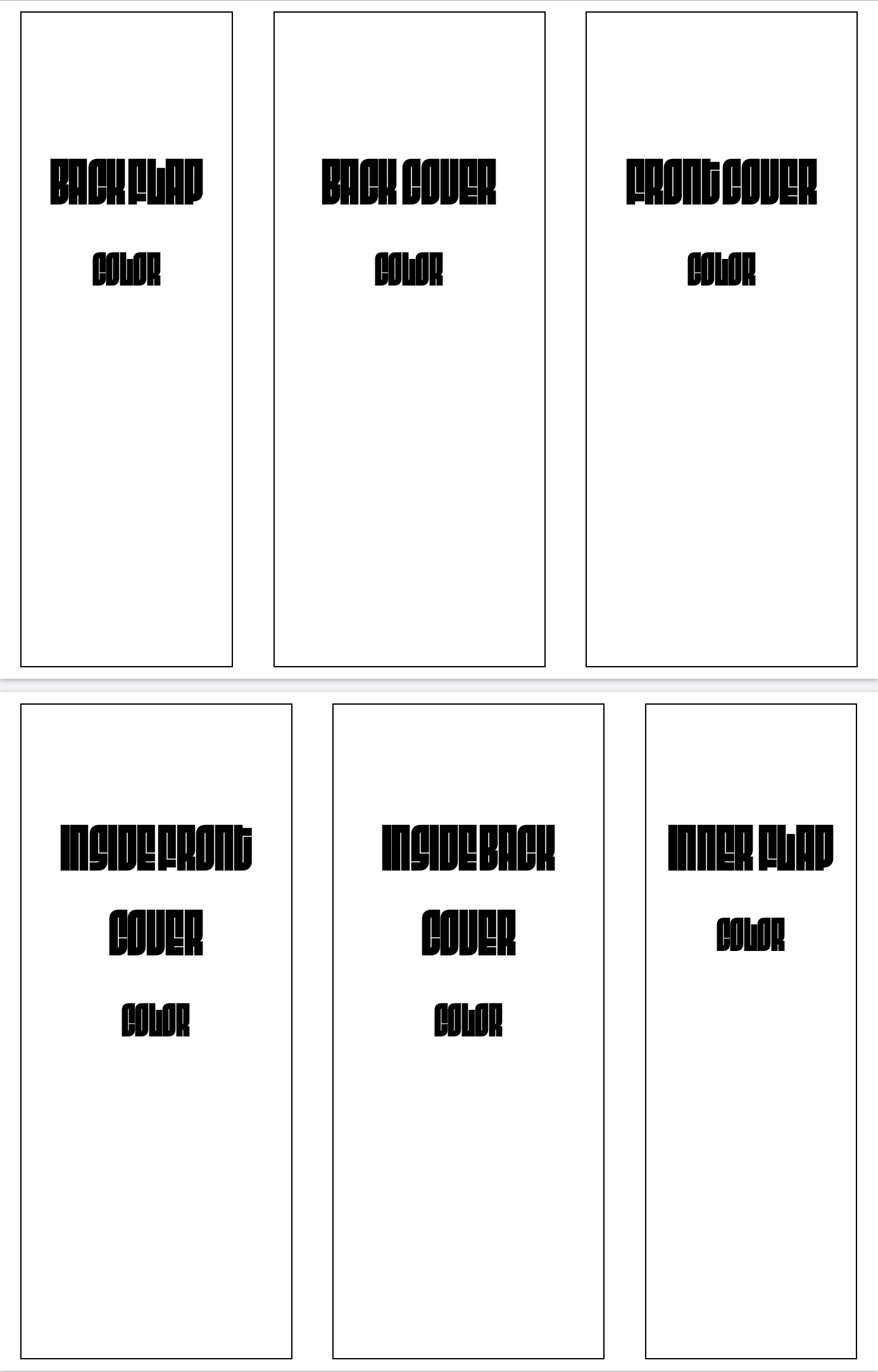
Given the difference between price tag and value, I spent a good deal of time trying to figure out how to evolve my simple one-sheet z-fold zine into something more while still being something I could achieve all on my own and still fit in a standard letter envelope. I designed what I think is a workable template that would triple the “content” (aka three total sheets), without increasing the cost too much, but becomes something I think would be worth the $5 price tag. To achieve this, I basically have two templates: the outside cover with a mostly standard brochure tri-fold and the inside z-folds.
For the outside cover, it would work as a simple trifold, but divided in a way that the front and back cover take up a bit more than 1/3 of the sheets real estate each (while still fitting in a letter envelope) with the third portion acting a bit more like a flap that tucks in. The larger width for the front and back cover ensures the inside z-folds are completely encompassed and covered within the cover to avoid the edges sticking out. Lastly, it would be printed on a heavier paper stock (60lb) and in color for only a tad more than it cost me to print my original one-sheet zine in color on 32lb paper.

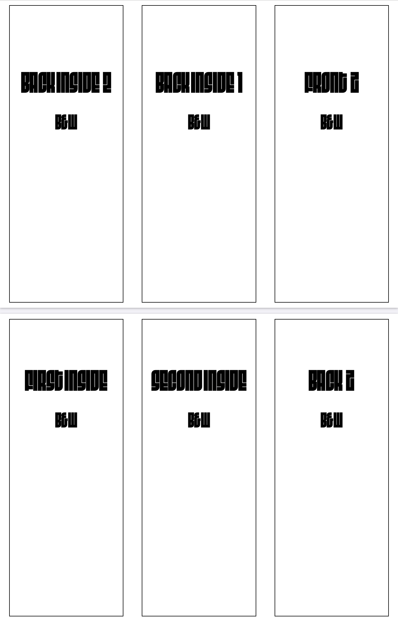
Then stapled to both of the inside seams of the cover sheet would be z-fold sheets in black and white. The z-fold for the inside makes it a little bit of fun to open up and navigate through; so after opening the cover and reading the inside cover, you’d work your way through the first z-fold, be presented with the inside of the back cover, work your way through the second z-fold, and then end with both sides of the flap and the back cover.

It’s admittedly difficult to describe and/or picture, but in practice it’s pretty fun.
While the mini-zine idea started as a project that would serve as a supplement to a much larger zine, the costs of printing and the extremely low quantities I’m printing make the larger zine pretty impractical for me, especially after considering the fact I was willing to sink $500 into paying for submissions to go into it already (of which I’d never get back)…
With all of that being said, I’ve shifted my focus a bit into getting the proof-of-concept for this three sheet zine put together and then sticking with this format as a place where I’d put the work I’d pay for through submissionsâ“albeit less per issue than the larger idea. I can get about 800 words plus title and author across three columns, so that gives me real estate for 3200 words across both z-folds, plus space for an introduction on the inside cover and then colorful artwork on the cover, back cover, inside back cover, and both sides of the flap.
The larger zine was designed with the idea of being both digital and print, while the mini-zine was only ever intended to be print only… so that’s something I’m still trying to work through and figure out the best route.
I have one copy left so I had to take the Stripe page down, but if anyone is interested…↩︎
