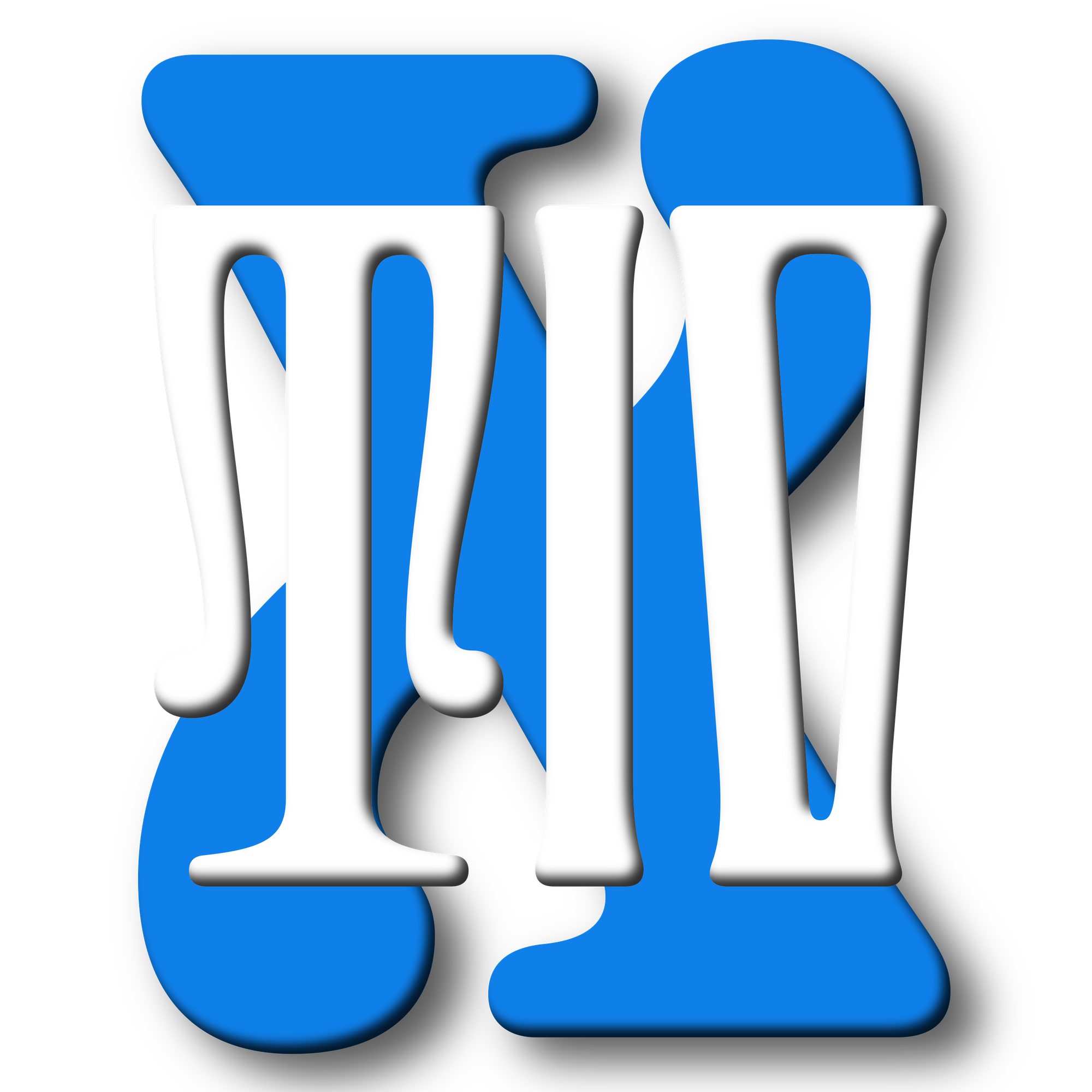

Pure insanity. Ferro Mono Black?! Are you kidding me?! And Black IV??? What??? I feel like I’m going into shock looking at these letterforms. Beautiful, delightful, should not exist.
fonts
6 postsPosts tagged with fonts
Font Club Belgica /// Future Fonts
FC Lead is using the constraints of merging pieces of glass together with lead into one solid drawing. Counterparts are created with light without any unnecessary cuts. Resulting in unconventional letters.
🤯
I have one word... woah... this is both magical and beautiful. Insta-buy.
AT Kyrios /// a curious, slightly psychedelic blackletter font family
Kyrios is a curious, slightly psychedelic blackletter family. Though it may seem like a modern idea, it is an interpretation of lettering from a grave monument carved in the late 1800s, located in Green-Wood Cemetery in Brooklyn, NY.
I want to give a big shout out to Stephen over at ArrowType for officially launching Kyrios 1.0 and graduating from Future Fonts on this one. We've been using Kyrios here at TIV for almost 2 years now, and it's hard to imagine any other font replacing it at this point. We've had a ton of really cool blackletter fonts, including Casserole from OH No and Albertus Nova, but none of them can hold a candle to Kyrios.
🔠 Onigiri
An absolutely stunning and delightful typeface. Instant buy for me.
🔠 Die Grotesk design information
Because every creative endeavour has a small part of your soul and spirit, it would be too vulnerable and unbearable to admit the real cost and fear involved in making something new and offering it up to the world, to our customers and savage imaginary contempt of our peers.
Not me thinking about buying Die Grotesk despite having both Untitled Sans and Helvetica (and a terrible eye that can only slightly tell the difference when they are side-by-side…) On a more serious note, I love reading these long pieces about the thoughts, ideas, and process that goes into designing something with care.
🔡 GT Era
Our latest release transforms the warmth of 19th century grotesks into a 21st century tool.
The new typeface from GT is very, very nice; falling somewhere between GT Standard and GT Flaire in terms of that minimal approach and infusing it with some personality.